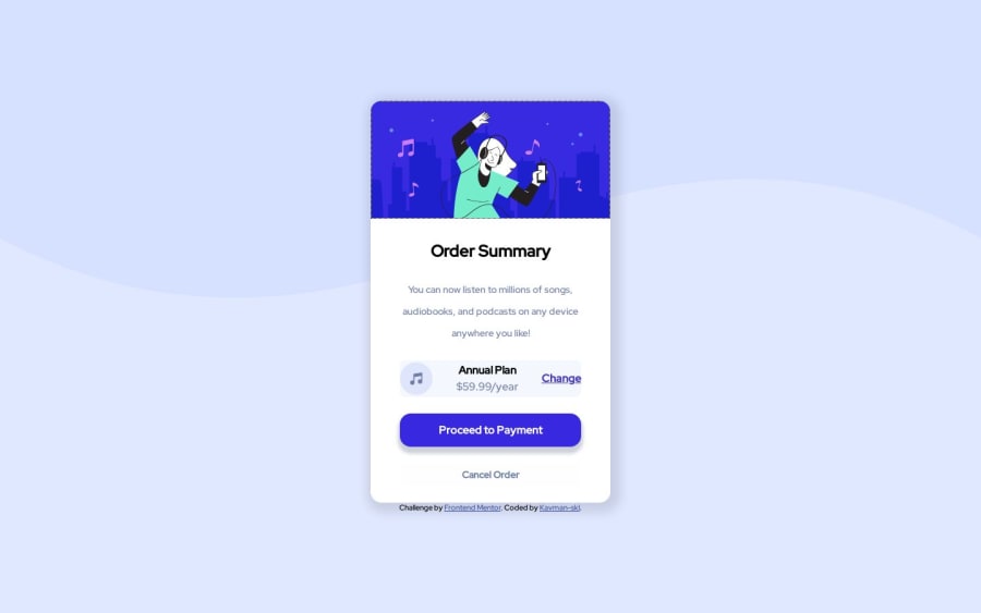
Design comparison
Community feedback
- @rayaattaPosted 11 months ago
👋hello Kavman-Ski, congratulations on completing this challenge 🎉 I have some suggestions you might find interesting. Semantic suggestions 1.You should replace the
<article class="contain">with<main class="contain">Thearticlewould have been good for a larger website with multiple components but in this case it is the only component so it is the main page content. 2.You may then usearticleto replace<div class="para">for better accessibility as divs have no semantic value. 3.you should also replace<div class="attribution">with<footer class= "attribution">Styling suggestions 1.it is much more recommended that you put a link to you fonts inside your html. 2.you should changeheight:100vh;on the body tomin-height:100vh;This will ensure that your layout doesn't break on shorter screens or mobile devices in landscape mode.I hope this helps Other than that your solution is great 👏. Happy coding 🙃
Marked as helpful1
Please log in to post a comment
Log in with GitHubJoin our Discord community
Join thousands of Frontend Mentor community members taking the challenges, sharing resources, helping each other, and chatting about all things front-end!
Join our Discord
