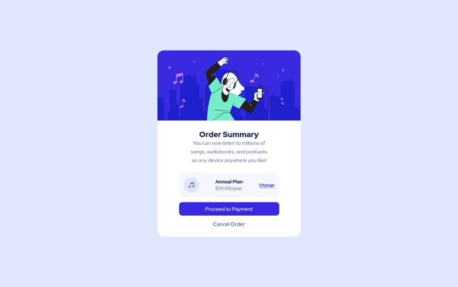
Design comparison
SolutionDesign
Solution retrospective
My mobile view is still incomplete
Community feedback
- @muhammadshajjarPosted about 3 years ago
Hi,
Some suggestions are:
- Better to add a margin on the left and right sides of your card because its sides collapse to the window on small viewports check the screenshot
- To overcome your accessibility issue you would need to add some semantic markers to designate sections of the page as the header, navigation, main content, and footer e.g:
<main> <section> </section> </main> <footer> <div class="attribute"></div> </footer>- Active states are missing, refer to active-state.jpeg for it
- change should behave as it controls something, and for controlling prefer
buttonfor navigation it is good to go witha
Apart from this very well done👍, Keep up the great work
Marked as helpful0@RutC9Posted about 3 years ago@muhammadshajjar Thank you ! Will add the remaining things soon!
0 - @CyrusKabirPosted about 3 years ago
hello my dear friend ♥ you did good and clean at all but here some problem :
- we can't see any hover statement on you card (link,button , etc)
- it's better to have more space between card heading and card text
Marked as helpful0
Please log in to post a comment
Log in with GitHubJoin our Discord community
Join thousands of Frontend Mentor community members taking the challenges, sharing resources, helping each other, and chatting about all things front-end!
Join our Discord
