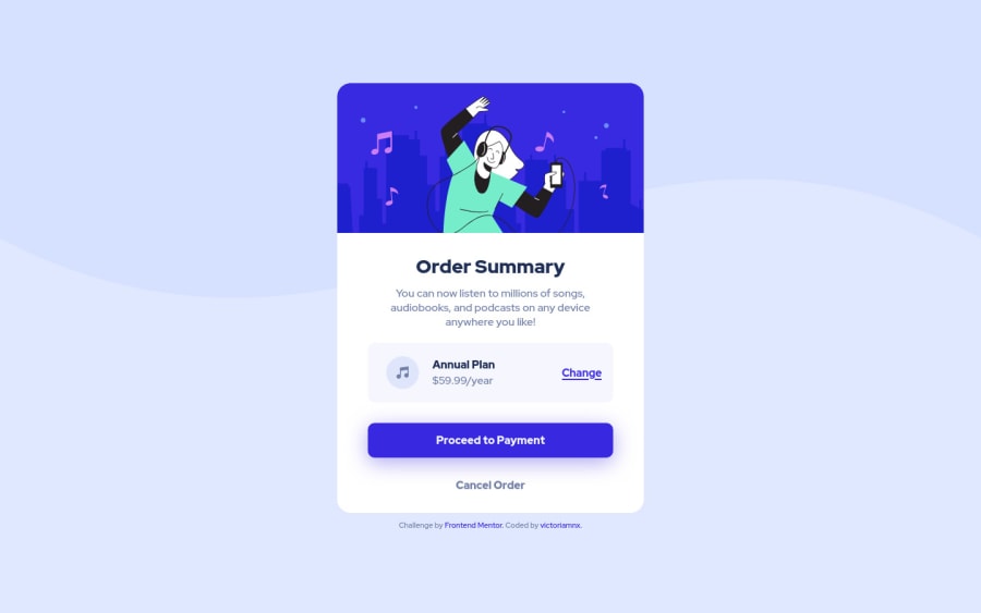
Design comparison
Solution retrospective
This challenge was super fun to do, I was able to train a different type of hover and also better understand how the z-index function works.
Community feedback
- @0xabdulkhaliqPosted over 1 year ago
Hello there ๐. Congratulations on successfully completing the challenge! ๐
- I have other recommendations regarding your code that I believe will be of great interest to you.
BACKGROUND iMAGE ๐ธ:
- Looks like the
background svg
andcolor
has been set withimg
element which causes accessibility issues, So let me explain How you can easily apply thebackground color
with thesvg
they provided without usingimg
element.
- Add the following style rule to your css, and then experience the changes
body { background: url(./components/images/pattern-background-desktop.svg), #E1E9Ff; background-repeat: no-repeat, no-repeat; }
- With the help of above css rules we achieve the background as per design, now remove the individual
img
elements from thebody
element
<img id="background" src="components/images/pattern-background-desktop.svg" alt="Background Pattern">
- It's just occupies extra space and causes overflow issues, Now it's all been cleared
- Tip, Don't forget to generate a new screenshot after editing the
css
file
BODY MEASUREMENTS ๐:
- The
width: 100%
property forbody
element is not necessary. becausebody
is a block level element which will take the full width of the page by default.
- So feel free to remove
width: 100%
style rule frombody
.
I hope you find this helpful ๐ Above all, the solution you submitted is great !
Happy coding!
Marked as helpful0@victoriamnxPosted over 1 year ago@0xAbdulKhalid Hi, thank you for your help, with the tips I managed to improve my code and also managed to avoid making the same mistake in other challenges. Thank you very much :)
0 - @HikmahxPosted over 1 year ago
Hey Victoria ๐, I just wanted to start by saying a great job on everything! I have some feedback that I think could be helpful:
- I was thinking that for the 'Change' and 'Cancel order' text, it might be better to use a button tag instead of an h2 tag. Since they're positioned like buttons and seem to be clickable, using button tags could make it clearer for users that they can interact with them, and it could also improve accessibility.
To make the website more responsive:
- Add a bit of padding to the body so that there can be space around the container when in mobile view:
body { padding: 1rem; }
- For the container, add width and max-width so the container doesn't overstretch, and also as the screen width increases, the container stops at the initial width you made it before:
.container { max-width: 450px; width: 100%; }
- Add a
width:100%
to the img tag of id illustration so it also becomes responsive with the container. - In the div of id price, change justify-content to space between so the elements in it shift to both ends with a flex-wrap for smaller screen devices so the div doesn't overflow in smaller devices:
#price { justify-content: space-between; flex-wrap: wrap; }
You can change the margin-right to auto in the element of id info to make this element stay at the left. This is because when you add
justify-content: space-between;
to the price parent element, it stays in the middle.Hope this helps
Marked as helpful0
Please log in to post a comment
Log in with GitHubJoin our Discord community
Join thousands of Frontend Mentor community members taking the challenges, sharing resources, helping each other, and chatting about all things front-end!
Join our Discord