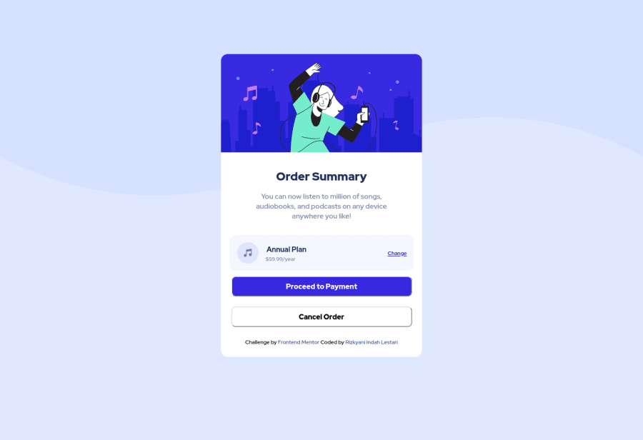
Design comparison
Solution retrospective
I don't know how to write "Challenge by Frontend Mentor..." outside the white section. Can anyone help me? I'd be happy to have some feedback ;) happy coding
Community feedback
- @denieldenPosted almost 3 years ago
Hi Rizkyani, good job!
You can change
footer
withp
and use this property:position: absolute; bottom: 0;
I had a look at your solution and I have a few suggestions for you:
- Try use Flexbox for center the card, read here -> flex guide
- set
heigth
of body to100vh
because Flexbox aligns to the size of the parent container. - remove all
margin
fromarticle
- try to adding a little
transition
on the element with hover effect ;)
Hope this help ;)
0@rzkyndhlstrPosted almost 3 years ago@denielden thank you so much for your feedback. But let me ask something.. why in my project challenge always get report like this "<html lang="en">" .. what's wrong?? I really don't understand.
1@denieldenPosted almost 3 years ago@rzkyndhlstr probably because you don't use the
main
tag to wrap the body core content.If it helps, don't forget to mark my comments as helpful;)
Thank you!
0@rzkyndhlstrPosted almost 3 years ago@denielden what is difference between "main" and "article"
1 - @FluffyKasPosted almost 3 years ago
Heyo, you wrapped everything inside the
article
element,footer
included. Just place yourfooter
outside of it!Also, decide whether you would like to use a button or an
a
, you can't nest them in each other. :)The rest looks pretty good! If you feel a bit comfortable with CSS, you could consider looking up relative units (em, rem, etc) that you could use instead of px.
0@rzkyndhlstrPosted almost 3 years ago@FluffyKas but if I dont wrapped footer inside article, the footer will be in right side, not in bottom. So I decided to wrapped footer in article. Thank you for feedback.
0@FluffyKasPosted almost 3 years ago@rzkyndhlstr Sure, you still need to tell your
footer
where to go, it won't read your mind :) If you don't specify where to go, it follows default rules. Amargin: 0 auto
would help centering things, if this is what you mean.0
Please log in to post a comment
Log in with GitHubJoin our Discord community
Join thousands of Frontend Mentor community members taking the challenges, sharing resources, helping each other, and chatting about all things front-end!
Join our Discord