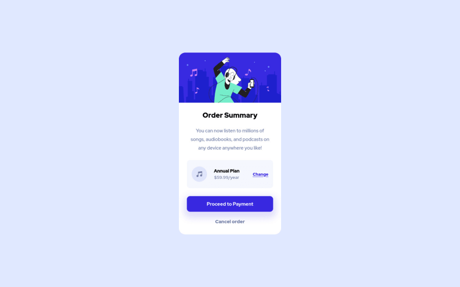
Design comparison
Solution retrospective
Hello coders,
This was a fun one to build.
I have a question about the width of the text: <p>You can now listen to millions of songs, audiobooks, and podcasts on any device anywhere you like!</p>
When I center it with text-align: center the width is not the same as the original from frontEndMentor.io. So what I did is, and i don't know if this is any good, is to
give it a width: 238px and then margin: 0 auto. Is this a good way or is there another even better solution?
Would love to get some feedback!
Greetings, Danny
Community feedback
Please log in to post a comment
Log in with GitHubJoin our Discord community
Join thousands of Frontend Mentor community members taking the challenges, sharing resources, helping each other, and chatting about all things front-end!
Join our Discord
