Submitted over 2 years agoA solution to the Order summary component challenge
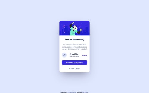
Order summary card
bem
@LevyMatias

Solution retrospective
- I used the B.E.M methodology in my solution to have better management of my html and css classes.
- I believe it is not 100% identical. I couldn't expand the background image to cover the width of the screen, so I didn't put it in.
- Any hints or suggestions I will be grateful.
Code
Loading...
Please log in to post a comment
Log in with GitHubCommunity feedback
No feedback yet. Be the first to give feedback on levy_m's solution.
Join our Discord community
Join thousands of Frontend Mentor community members taking the challenges, sharing resources, helping each other, and chatting about all things front-end!
Join our Discord