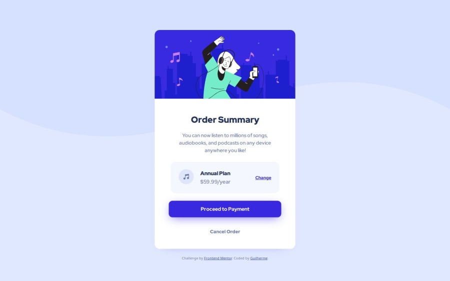
Order Summary Card - HTML and CSS (Internal CSS code |
Design comparison
Solution retrospective
- First of all I'm proud that I simply did it!
- This, since is my first challenge, motivated me to keep going at my bootcamp and showed me that I am really learning what I'm studying.
- I'm also glad that now I'm understanding how this challenge community works.
- The first challenge was to understand what Frontend Mentor Challenge wanted from me, and that was overcome by the readme files that comes in the download package and also with the resources at the Discord server.
- The second challenge was to write down the codes itself, this was my first "big" blank file that I had to structure and style, but I overcame that remembering everything that I had learn at Colt's Bootcamp and also by using my study notes.
- Flex, it looks like that this will be a challenge for a while.
- Definitely, the hardest challenge was SVG. At first I thought SVG would be easy peasy, but that required a lot of googling and help from study friends. And I still not sure if I did it correctly.
- A feedback on the general structure of the file would be highly appreciated.
- At the body I used an encoded version of the svg as a background (Encoded at Meyerweb) (Is it ok to work this way?)
body {
      background-color: hsl(225, 100%, 94%);
      background-image: url("data:image/svg+xml,%3Csvg%20xmlns%3D%22http%3A%2F%2Fwww.w3.org%2F2000%2Fsvg%22%20width%3D%221440%22%20height%3D%22437%22%3E%3Cpath%20fill%3D%22%23D6E1FF%22%20fill-rule%3D%22evenodd%22%20d%3D%22M0%20349.974c218.558%20116.035%20460.05%20116.035%20724.475%200s502.933-116.035%20715.525%200V0H0v349.974z%22%2F%3E%3C%2Fsvg%3E");
      background-position: top;
      background-repeat: no-repeat;
      background-size: contain;
      display: flex;
      flex-direction: column;
      align-items: center;
    }
- I also tried to use a encoded svg for the top image of a person dancing, but it didn't work, maybe because it was too long. So I googled for that svg url on a third-party website and used that as an external url:
- At the music note svg I could work with the inline without problems, but I feel that if I had to scale it I would have problems. That's why I didn't use inline svg for that "person dancing" image, because I couldn't scale it when it was styled inline with .
        Annual Plan
        $59.99/year

      Change
- A feedback on the flex structure would help a lot. I feel that I may have added some extra codes that I wouldn't need to.
body {
      display: flex;
      flex-direction: column;
      align-items: center;
    }

    main {
      width: 450px;
      background-color: white;
      display: flex;
      justify-content: center;
      align-items: center;
      flex-wrap: wrap;
      flex-direction: column;
    }

    .woman {
      overflow: hidden;
      border-top-left-radius: inherit;
      border-top-right-radius: inherit;
    }

    .description {
      text-align: center;
      text-size-adjust: auto;
      line-height: 24px;
    }

    .planContainer {
      display: flex;
    }

    .planColumn {
      display: flex;
      flex-direction: column;
    }

    .attribution {
      text-align: center;
    }
- And finally, @media I basically copied all the css styles and removed what I didn't need to resize when the screen got smaller.
Community feedback
- P@denissejoycePosted 10 months ago
Hey Guilherme, good job on completing the challenge 🎉
I have a couple of suggestions for you for your next project—
-
When we finally deploy our projects online, one other thing that we want it to be is SEO-friendly; to achieve this, it would be helpful to store your CSS styles in another file instead so that your HTML file is easier to read for search engines
-
As for the alignment of your card, I see that it can be 'more' vertically centered, you can do this by adding
min-height: 100vhto your flex container/flex parent element (this sets the flex container's minimum height into 100% of the viewport) -
For your future projects, I also recommend you implement a mobile-first approach when setting your CSS rules (mobile designs tend to be simpler compared to desktop designs which makes it easier to start here); I see in your README file that you are familiar with Kevin Powell so I suggest this helpful read from him about the use of mobile-first approach!
(I am not very well-versed with SVGs so I do not have any feedback about it)
Marked as helpful2@dz03vcPosted 10 months ago@denissejoyce What a feedback!! I Really appreciate it!! Regarding the separate CSS file, I know that working this way is better for search engines, but since it was my first challenge I didn't know if I could upload two separate files here, that's why I did it inside the html. Anyways, I just corrected it. Now you can find "index.html" and "styles.css". About vh and mobile-first (kevin powell), that really helped and I'll study more about the subjects.
Thank you, Denisse!!
0 -
- P@studentiyotPosted 10 months ago
This is an excellent first challenge, inspiring me to attempt my first soon. I'm intimidated by the SVG component, but the author's README (at the repo) offers helpful hints and resources specific to SVG.
The code looks well-organized and semantically correct. Well done!
Marked as helpful1
Please log in to post a comment
Log in with GitHubJoin our Discord community
Join thousands of Frontend Mentor community members taking the challenges, sharing resources, helping each other, and chatting about all things front-end!
Join our Discord
