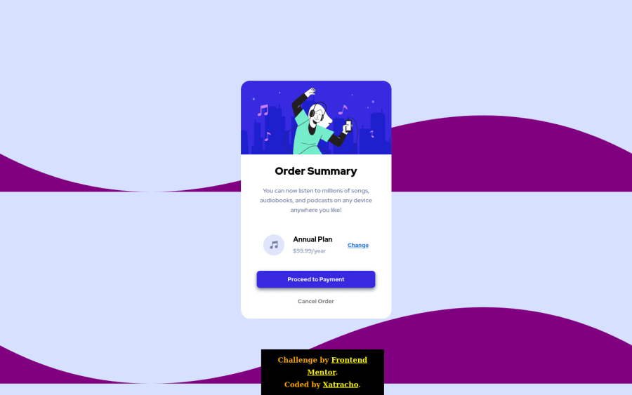


Design comparison

Solution retrospective
Feedback is welcome! I don't believe I got the media query right, but I can live with it for now.
Community feedback
- @c-healeyPosted over 3 years ago
Hi, let me introduce you to pseudo elements. I learned so much on frontend mentor looking at how other people implemented the challenges. One thing I learned was to use a pseudo element to position background images and other things.
an example pseudo element looks like this: body::before { content: ""; background-image: url(./images/bg-mobile.svg); background-size: cover; background-repeat: no-repeat; position: absolute; top: 0; left: 0; bottom: 0; /* height: 100%; */ width: 100%; } you can use media queries to change the any of the attributes @media (min-width: 768px) body::before { background-image: url(./images/bg-desktop.svg); top: 40vh; }
The above code is from one of my solutions https://c-healey.github.io/fylo-data-storage-bootstrap/index.html
you can read more about pseudo elements https://developer.mozilla.org/en-US/docs/Learn/CSS/Building_blocks/Selectors/Pseudo-classes_and_pseudo-elements#what_is_a_pseudo-element
2 - @xatrachoPosted over 3 years ago
I just realized that I should've increased the max-width on the pricing section in the media query. Yikes!
0

Please log in to post a comment
Log in with GitHub
Join our Discord community
Join thousands of Frontend Mentor community members taking the challenges, sharing resources, helping each other, and chatting about all things front-end!
Join our Discord