Design comparison
Solution retrospective
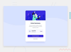
I am not sure about the box shadows I used. I know the button has one but I think I also saw a shadow for the card or may just be bad resolution for the design images.
Any feedback is appreciated :)
Community feedback
- @cluod-AlfakhrePosted over 2 years ago
really great job congratulations 👏
you just need a little update to your HTML so the accessibility issues disappear.
First the html file should contain at least one "h1" element.
Second the headings elements should level up gradually (h1, then h2 ,h3 ....).
i hope this was helpful and thanks 👍
1@CharlieeLuna23Posted over 2 years ago@cluod-Alfakhre Thanks a lot!
Yes, that's what I'm seeing, I get a that in all my projects, I suppose I could just use the H1 for the order summary and just change the size, right?
1@cluod-AlfakhrePosted over 2 years ago@CharlieeLuna23 that will get over the issue, put it's not considered a best practice
0@CharlieeLuna23Posted over 2 years ago@cluod-Alfakhre That's why I was using a different heading, I just don't see where I can put an H1 in this design.
0@cluod-AlfakhrePosted over 2 years ago@CharlieeLuna23 that happens to me a lot 😅
Marked as helpful1
Please log in to post a comment
Log in with GitHubJoin our Discord community
Join thousands of Frontend Mentor community members taking the challenges, sharing resources, helping each other, and chatting about all things front-end!
Join our Discord
