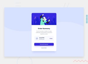
Design comparison
Solution retrospective
just some feedback for current project
Community feedback
- @MohammedOnGitPosted 6 months ago
Hello Karim Hussein!
Your Order Summary Card HTML structure is looking good. Here are a few enhancements and suggestions:
- Image Alt Attributes Alt text should be descriptive. For example, the alt for the music icon and hero illustration can be more specific:
-
Button Styles Since you are using two buttons (for "Proceed to Payment" and "Cancel Order"), consider styling them differently to indicate their actions more clearly (e.g., a primary and secondary button). This can be handled in your CSS.
-
Accessibility Enhancements Make sure your buttons are distinguishable for screen readers by specifying aria-label attributes, especially if you have multiple buttons that perform different actions:
<button aria-label="Proceed to Payment">Proceed to Payment</button> <button aria-label="Cancel Order">Cancel Order</button>
- Form Elements Since this is an order summary card, it's likely related to user actions that may involve submitting a form. Consider wrapping the buttons inside a <form> if this section handles submission actions.
- Links vs Buttons The "Change" action might work better as a button if it triggers an action (instead of just a navigation link). You can style it as a link while keeping it a button for better semantics:
<button class="link-button">Change</button>
- Footer The footer attribution section could also be wrapped in a footer tag for better semantics:
Final Thoughts Your code is clean and follows a solid structure, but adopting these best practices will improve the performance, accessibility, and maintainability of your Order Summary Card project. Keep it up!
Marked as helpful0
Please log in to post a comment
Log in with GitHubJoin our Discord community
Join thousands of Frontend Mentor community members taking the challenges, sharing resources, helping each other, and chatting about all things front-end!
Join our Discord
