Design comparison
Solution retrospective
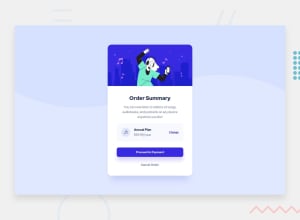
Got stuck for awhile on the best way to align the music icon, annual plan, price and change link. Ended up using flex box with space between and adding margin. Is that the best way?
Also, couldn't quite get the background to line up exactly as the example.
Overall just wondering if there is a simpler/cleaner way of doing this.
Community feedback
- @BernardusPHPosted over 2 years ago
-hello BINGERMINN, If you are talking about using a better method for the body's background, I did the following on your site, so see for yourself:
body{
/* background-position: center top; */
background-size:contain;
}
-See if it helps.
-Also just some advice but try adding an:
@media(max-width:430px){ .main-card{ width:90%; } }- for mobile( just fix some of the overflowing that will happen)
Marked as helpful2@yallsobadPosted over 2 years ago@BernardusPH Thanks for the feedback!
I was able to simplify it slightly using:
background-image: url(images/pattern-background-desktop.svg); background-size: contain; background-repeat: no-repeat; background-color: var(--Pale-blue);
1 - @vanzasetiaPosted over 2 years ago
Hello there! 👋
Regarding the background image for the
bodyelement, if you see on the design comparison, the background image has perfectly matched the design. So, I don't think there's an issue. 🙂Now, about the
cart-itemsection, you've done a great job with it. I used flexbox andmarginwhen I was building it.Some feedback from me.
- Alternative text for images should not contain any words that related to image (e.g. picture, photo, logo, icon, graphic, avatar, etc). It's already an image element so the screen reader will pronounce it as an image.
- The illustration and the icon are decorative images so leave the
altempty. - I suggest removing the
divthat wraps anchor tags andbuttonand styling the element itself directly. This will make the HTML looks cleaner and more simple. - Always specify the
typeof thebutton. In this case, set the type of them astype="button". It's going to prevent the button from behaving unexpectedly.
That's it! Hope this helps. 😊
Marked as helpful1
Please log in to post a comment
Log in with GitHubJoin our Discord community
Join thousands of Frontend Mentor community members taking the challenges, sharing resources, helping each other, and chatting about all things front-end!
Join our Discord
