Design comparison
Community feedback
- @visualdennissPosted over 1 year ago
Hey there,
Very nice work overall. I'd have few small suggestions:
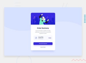
Font-sizes seem to be a bit too small, especially the 'change' link and the title can be bit bigger as in the design.
cancel order should not be a <p> but a button as it is an interactive element. And all interactive elements should have some change on hover to indicate interactivity to the user. The most basic is cursor:pointer; like you have for 'change'. But adding a background change to the button on hover is also big plus. (if the button does not have any bg like 'cancel order' you can just change the font-color or add text-underline etc)
Hope you find this feedback helpful!
Marked as helpful0@class-pedroPosted over 1 year ago@visualdenniss Thank you again! I'm keep going \o/
0
Please log in to post a comment
Log in with GitHubJoin our Discord community
Join thousands of Frontend Mentor community members taking the challenges, sharing resources, helping each other, and chatting about all things front-end!
Join our Discord
