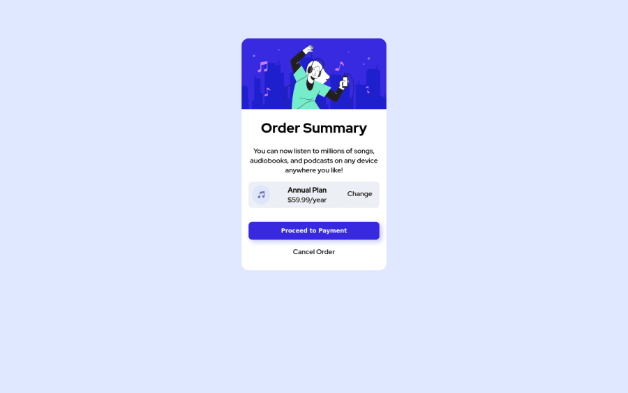
Design comparison
SolutionDesign
Community feedback
- @correlucasPosted over 2 years ago
👾Hello Robert, congratulations for your solution!
You've done a really good work here wrapping all component content inside the
<main>, but note that your container isn't responsive yet, to do that, you can use a quick fix replacing thewidthyou've usedvwand usemax-widthsee the corrections below:.card { border-radius: 1rem; display: flex; flex-direction: column; justify-content: center; text-align: center; max-width: 350px; background-color: white; /* width: 23vw; */ margin-top: 5rem; border: 0px solid black; padding: 0rem; }Hope it helps and happy coding!
Marked as helpful1
Please log in to post a comment
Log in with GitHubJoin our Discord community
Join thousands of Frontend Mentor community members taking the challenges, sharing resources, helping each other, and chatting about all things front-end!
Join our Discord
