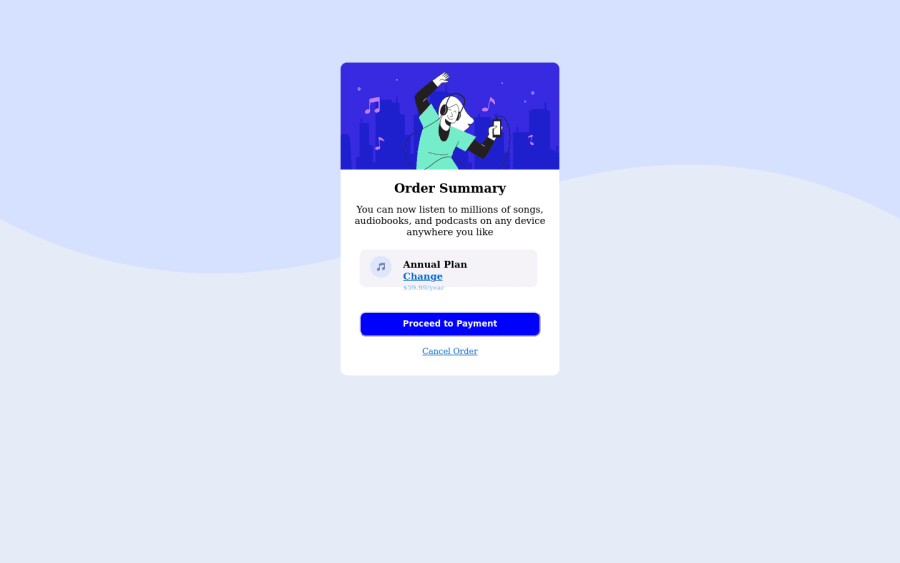
Design comparison
Solution retrospective
The comparison page of solution and design is usually different from what I actually designed and what shows on the website, it is something I should worry about, and it's there anything I could do to make it the same?
Community feedback
- @correlucasPosted over 2 years ago
Hello Victor,
Congratulations for your solution!
I know is tricky to match the design image reference, something that can help you is to use devtools in Google Chrome and Firefox and use the screens sizes given in the
styleguide.mefile from start files. To open devtools in these browsers just press F12.Once you open devtools in your browser, you can see that there's a bar where you can choose the screen resolution and also some mobile devices sizes. For the Frontend Mentor challenges often is used two screen sizes 1440px for desktop and 375px for mobile. So all you need to do is set this resolutions in your browser and build your solution looking the live preview in your browser with the devtools mode on this way you see the exact resolution the challenge was built.
Your solution seem good, you did all the html structure correct, now all you miss is set the correct colors to the elements and work a little bit the small details as the paddings and border(note that the button doesn't need a border color). Its hard to match the exact colors for the challenge, so for this you can use the Google Chrome extension ColorZilla that's a color picker and use it to eyedrop the colors, this extension give you the color code to drop direct to your code.
If you want to use my solution as a reference for colors and stuff, here's the link: https://www.frontendmentor.io/solutions/order-summary-component-vanilla-css-custom-wave-background-hover-tEKUwaT2id
Victor, I hope it help you, and if you want, feel free to ask me any question I'll be happy to help you. Happy coding!
Marked as helpful1@victorebegbunaPosted over 2 years ago@correlucas After pressing F12, where exactly do I go to adjust the resolution
0@correlucasPosted over 2 years ago@victorebegbuna when you press f12 will appear a panel in the top left you'll see a phone icon, if you click will enable the mobile mode and some fields to set rhe width and height for the screen. Here's a quick guide: https://blog.hubspot.com/customers/design-updates-in-browser-guide
Marked as helpful0
Please log in to post a comment
Log in with GitHubJoin our Discord community
Join thousands of Frontend Mentor community members taking the challenges, sharing resources, helping each other, and chatting about all things front-end!
Join our Discord
