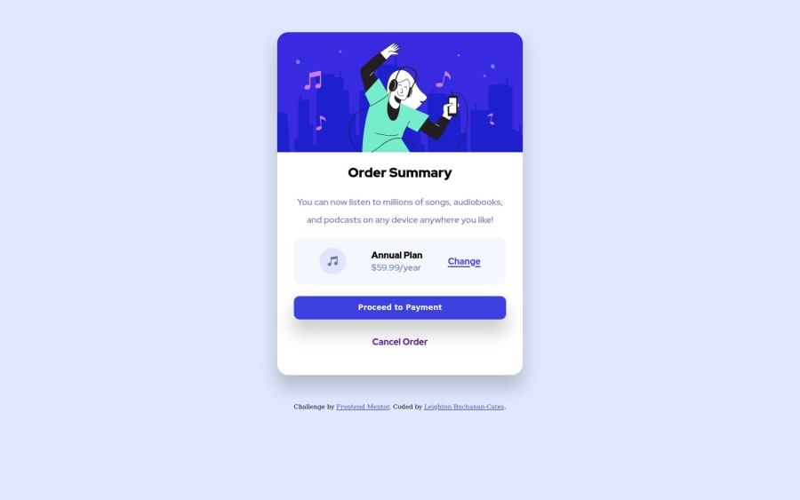
Design comparison
Solution retrospective
Centering objects was a struggle, but i did get it done. I was unsure about the background image and how centered it was. Any help is greatly appreciated.
Anybody have tips for coding for tablet sizes?
Community feedback
- @Sdann26Posted over 2 years ago
Adding to the comment of @Ahmed Bayoumi
The text "Order Summary" and "Annual plan" have the following color:
color: hsl(223, 47%, 23%).By the way I don't recommend in this case to give percentage to your card because depending on how much the page is squeezed it will deform better use a fixed measurement:
.container {
  width: 400px;
}
I mention this because I tried to center the card and it was deformed, now if you make that change you can center it vertically by adding to the body the min-height attribute
body {
  background-image: url("file:///Users/user1/Desktop/projects/order-summary-component-main/images/pattern-background-desktop.svg");
  background-repeat: no-repeat;
  background-size: contain;
  display: grid;
  place-items: center;
  min-height: 100vh;
}
Although in this case I would recommend you to use flex because if you do it with grid consider the attribution of the size of the card to center them.
By the way the background does not load you use a relative path to the root of the project instead of the absolute path.
I hope my comments are helpful.
Marked as helpful1
Please log in to post a comment
Log in with GitHubJoin our Discord community
Join thousands of Frontend Mentor community members taking the challenges, sharing resources, helping each other, and chatting about all things front-end!
Join our Discord
