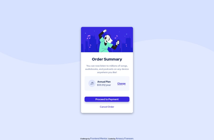
Design comparison
Solution retrospective
Hi everyone,
Feel free to give any advice to improve this code.
I know I did it fastly so I am aware it has a messy code without BEM or other clean organization and I cound have avoid any media-queries by a better layout choices. I have not tackled yet accessibility issues. I am open to advice about it and I will improve it by myself once I am free from other duties.
Better to publish it once really finished is to enrich myself with advice when it is almost finished. I may have for example use ::before for music icon to avoid taking DOM place optimizing the rendering.
I try to use calc(base - vw or %) for the first time: I think it is a good way to scale proportionally our font-size for example. It can also be used to automatically resize a padding/margin once we reduce the viewport, but I only use linear proportion by adding, I think we need sometimes to multiply or divide to reach good ratios.
Have a good moment with my project.
Community feedback
Please log in to post a comment
Log in with GitHubJoin our Discord community
Join thousands of Frontend Mentor community members taking the challenges, sharing resources, helping each other, and chatting about all things front-end!
Join our Discord
