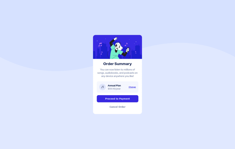
Design comparison
Solution retrospective
Any suggestions are welcome! :)
Community feedback
- @correlucasPosted about 2 years ago
👾Hello @VanessaAz, Congratulations on completing this challenge!
Great code and great solution! I’ve few suggestions for you that you can consider adding to your code:
Your background is applied but it's not too similar to the design yet. Add
background-size: containinstead ofbackground-size: coverto make it display the size full width and center with the card vertically. Note that now is slightly different from the challenge design.Here’s the code with the modification and the image applied as background:body { background-size: contain; background-image: url(./images/pattern-background-desktop.svg); background-repeat: no-repeat; display: flex; flex-direction: column; justify-content: center; align-items: center; height: 100vh; font-family: 'Red Hat Display', sans-serif; font-size: 0.9375rem; background: url(images/pattern-background-desktop.svg) contain no-repeat; background-color: hsl(225, 100%, 94%); padding: 0.5em; }✌️ I hope this helps you and happy coding!
Marked as helpful0@VanessaAzPosted about 2 years ago@correlucas is already done, in the first image we can't put it like this
background: url(images/pattern-background-desktop.svg) contain no-repeat;
it stops working, do you have any explanation you can give me?
1@correlucasPosted about 2 years ago@VanessaAz I think maybe the problem is the sequence of the background shorthand, I ever prefer to use the properties separately
https://www.w3schools.com/css/css_background_shorthand.asp0
Please log in to post a comment
Log in with GitHubJoin our Discord community
Join thousands of Frontend Mentor community members taking the challenges, sharing resources, helping each other, and chatting about all things front-end!
Join our Discord
