Design comparison
SolutionDesign
Community feedback
- @KeithLionPosted about 2 years ago
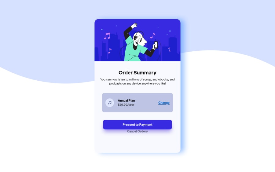
Hey great job with this project. There's a few things that can be improved, if you set the background color to the pale blue that would add the two shade effect in the solution. For the cancel order link try adding some padding to the top to create that distance. To get the paragraph to look closer try changing the color to the desaturated blue with the font weight set to 500. Also see how the item box looks with the background color set to the very pale blue. Again awesome work.
Marked as helpful0
Please log in to post a comment
Log in with GitHubJoin our Discord community
Join thousands of Frontend Mentor community members taking the challenges, sharing resources, helping each other, and chatting about all things front-end!
Join our Discord
