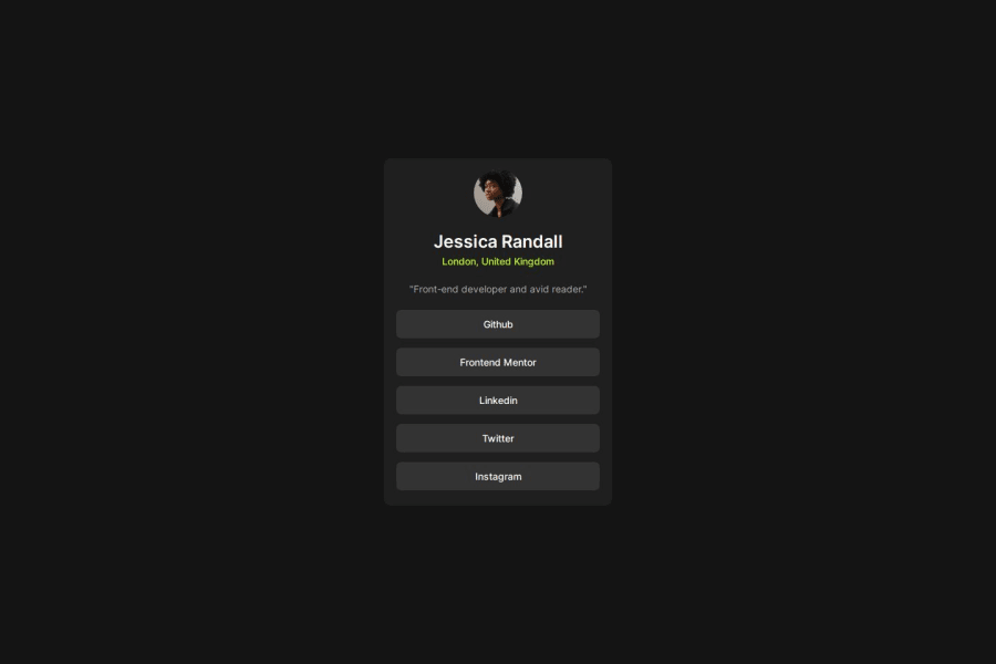
Design comparison
SolutionDesign
Community feedback
- @Subham0813Posted 9 months ago
Nicely done🚀 , my suggestion is that the paragraph's color should be matched with the design.
Marked as helpful0@ItsYasserPosted 9 months ago@Subham0813 yes but sometimes without having access to the figma file its hard to know which color goes where so i kinda focus on the important thing and leave things like colors and fonts because they are easy to change and repetitive
1
Please log in to post a comment
Log in with GitHubJoin our Discord community
Join thousands of Frontend Mentor community members taking the challenges, sharing resources, helping each other, and chatting about all things front-end!
Join our Discord
