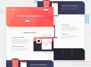
Design comparison
SolutionDesign
Solution retrospective
you will not saw the full site screen because I worked animation on scroll and you can enter the site yourself to make sure and your rate 😁💛
Community feedback
- @tedikoPosted over 3 years ago
Hello, darwin watterson! 👋 Good effort on this challenge! Everything works good and responds well. Kudos for this nice animations on page scroll. Take a look at:
- Add the empty
alt
attributes for the.image-block
.image
images, as they don't add any extra context for screen reader users. Since your images are decorative youralt
text should be provided empty (alt="") so that they can be ignored by assistive technologies. This get rid of those report errors. - Add
:focus
pseudo class to interactive elements like anchors, buttons etc. Useoutline
property to make your website more accessible to keyboard users. Focusable elements like anchor, buttons or inputs they have applied default:focus
pseudo class withoutline
property. These default styles are subtle and hardly visible tho. Furthermore every browser has a slightly different default style for the outline, so you probably want to change the default style. Read more about why we should change focus styles. - Since you're using a lot of animations, read about
prefers-reduced-motion
CSS media feature which is used to detect if the user has requested that the system minimize the amount of non-essential motion it uses.
Good luck with that, have fun coding! 💪
1 - Add the empty
Please log in to post a comment
Log in with GitHubJoin our Discord community
Join thousands of Frontend Mentor community members taking the challenges, sharing resources, helping each other, and chatting about all things front-end!
Join our Discord