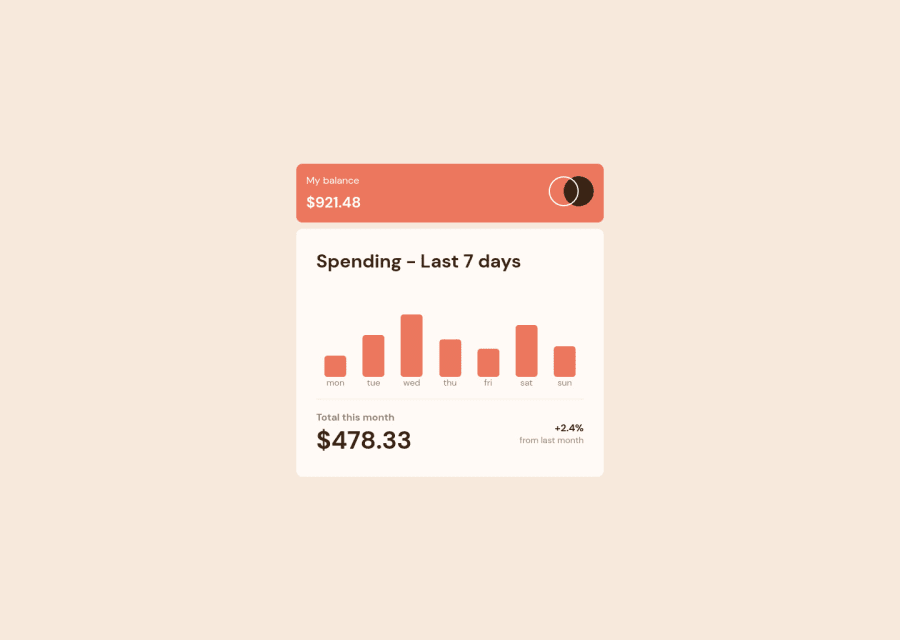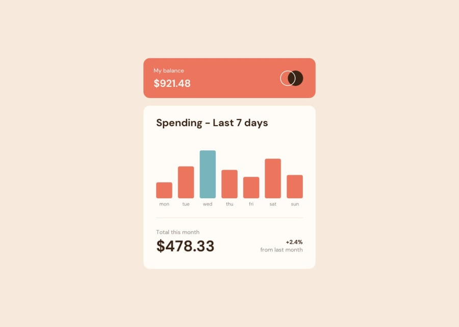
Design comparison
SolutionDesign
Solution retrospective
Any feedback is appreciated
Community feedback
- @MargaritaBusyginaCaPosted almost 3 years ago
Looks great! I would only suggest making your main containers bigger, so it occupies more space on the screen. You can implement it by adding padding to the inside components (for example, you can increase the padding of "Total this month $478.33") I think if you have one component on the page, you can afford to make it bigger, so it doesn't look too empty. Overall, good job!
Marked as helpful1
Please log in to post a comment
Log in with GitHubJoin our Discord community
Join thousands of Frontend Mentor community members taking the challenges, sharing resources, helping each other, and chatting about all things front-end!
Join our Discord
