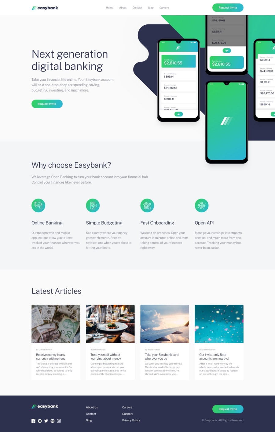
Design comparison
SolutionDesign
Solution retrospective
I didn't really make it responsive, it is intended as a full-size desktop version. I had most trouble positioning images in the main section and articles. Would be really grateful for any comments and suggestions :)
Community feedback
- @mattstuddertPosted over 4 years ago
Nice work on this challenge! Your desktop version looks great. As you mentioned, a great next step would be to make the site responsive. Also, you've currently got the main page heading as a
spanelement, whereas I'd say it makes more sense as ah1.I'd also recommend taking a look at the report and trying to resolve the issues. You've done a really good job though. Keep it up!
0
Please log in to post a comment
Log in with GitHubJoin our Discord community
Join thousands of Frontend Mentor community members taking the challenges, sharing resources, helping each other, and chatting about all things front-end!
Join our Discord
