


Raymart Pamplona• 16,140
@pikapikamart
Posted
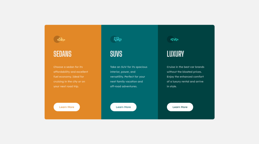
Hey, great work on this one. The layout both desktop and mobile is good and it responds and scales very well on screen changes.
Also, great that you adopting certain methodologies, although I don't know what is SMACSS but hey, if you got it, that's really great.
Some suggestions would be:
- Always have a
h1element on a webpage. On this one, theh1would only be a screen reader text. It might seem new to you, but this is intended for screen reader users. Theh1element would look like:
<h1 class="sr-only">Frontendmentor car collections examples</h1>
The sr-only class is just a css stylings, you can search some up in google. This h1 would be the first text element inside the main.
- Avoid using
height: 100%orheight: 100vhon an element. This will make the element's height limited to the viewport's height. On yourbodyandmainremove those css styling. That is a bad practice. Instead, on yourmainelement. Add these:
align-items: center; # centers the content vertically
min-height: 100vh; # makes sure it have necessary height and will expand
- On the
sectionelements, you don't need to usetransformon those element. Let themainflex container centers them properly, just addpaddingto a certain parent element. - An
atag doesn't have atypeattribute. Remove those,buttonelement andinputhave those.
Overall, it looks good. Great work again.
Marked as helpful
1
Ozan GOKDEMIR• 50
@ozangokdemir
Posted
@pikamart Your feedback is very clear and complete, so thank you for the time you spent on writing it. I will take all your suggestions in consideration and update my work according to your advices.
Thanks again for your kind help !
0
