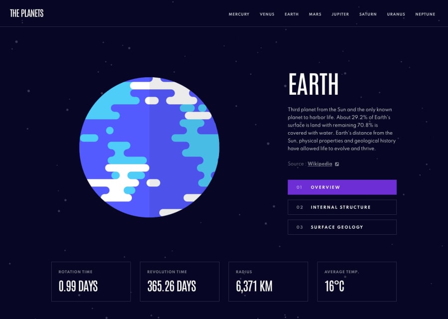
Planet Facts - Only Astro SSG
Design comparison
Solution retrospective
Disclaimer: this is my very first Astro project so the code may look kind of messy.
I have only one problem: I can't figure out why on mobile the layout is cut in the 4th card (the temperature one). It doesn't happen when I test it on desktop, even when using the responsive tool, at any width or height the layout seems normal, but when I open it in my phone it has that specific problem. Other than that it works
Community feedback
- @ABojoPosted over 1 year ago
I believe the address bar that is present on mobile devices is what's causing the card to be cut off. The two solutions that should work are: adding a height of 100% to the html element, or giving the body a height of 100dvh, rather than 100%.
1 - @Saad-HishamPosted over 1 year ago
This is very nice the animation when toggle too was amazing great job 🥰
1
Please log in to post a comment
Log in with GitHubJoin our Discord community
Join thousands of Frontend Mentor community members taking the challenges, sharing resources, helping each other, and chatting about all things front-end!
Join our Discord
