Design comparison
SolutionDesign
Solution retrospective
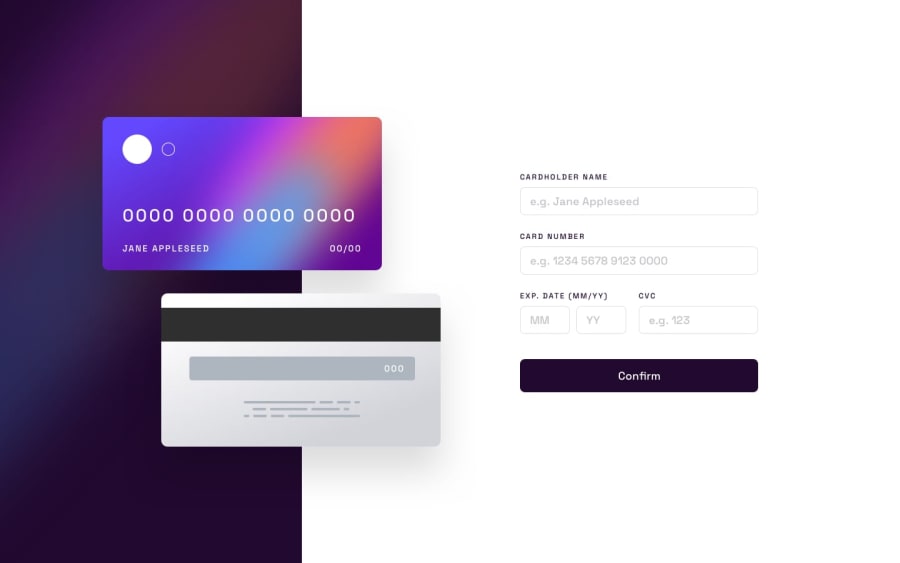
I had issues separating the numbers of the card details and specifying how the error messages look like. I would still work on that but I just wanted to get some feedback I also made a mistake by using "position" which made my mobile version way harder. Let me know in the comments what you did differently
Community feedback
Please log in to post a comment
Log in with GitHubJoin our Discord community
Join thousands of Frontend Mentor community members taking the challenges, sharing resources, helping each other, and chatting about all things front-end!
Join our Discord
