Design comparison
Solution retrospective
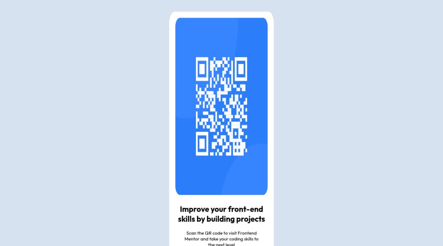
As I haven't practiced CSS a lot, I was very unsure of dimensions of the elements. Somehow, tweaking the number of pixels doesn't seem right: if there're no dimensions specified in the design, you end up eyeballing everything (I would have preferred to have exact dimensions for padding and margins but maybe it's not how it's done?).
I used a red border on every element while editing CSS to be able to see where which element is. Is that considered good practice?
Community feedback
- P@a-costasPosted almost 2 years ago
Hi there! Nice job completing your first challenge!
Unfortunately, without the Figma guides, you are left to speculate as to padding, margins, etc, but I think you've done well regardless.
My main note is avoid using fixed sizing for things like height and even width as much as possible as it can make your application less responsive. On a similar note, consider using
remunits instead ofpx. Here's a video you may find helpful on that front: Are you using the right CSS unitsOther than that, nice job and happy coding!
Marked as helpful0@TungsticPosted almost 2 years ago@a-costas Thank you! I know it looks weird but I'm going to leave it as is for now and edit it after I've learnt about responsive CSS. I honestly find it more challenging than JavaScript :D
0
Please log in to post a comment
Log in with GitHubJoin our Discord community
Join thousands of Frontend Mentor community members taking the challenges, sharing resources, helping each other, and chatting about all things front-end!
Join our Discord
