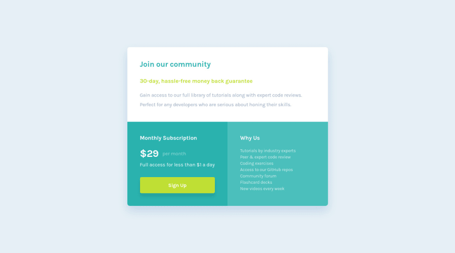
Onboarding Pricing Component - Pure HTML & CSS
Design comparison
Solution retrospective
My first FM challenge!
Question: Is the way I used the :root variables in media queries to adjust font sizes a good solution? Ended up storing only the intro card font sizes and I'm not sure if I should've done that lol!
I know this challenge is on the simpler side, but I really want to establish my pure HTML & CSS before I move on to more complicated challenges!
P.S Congrats to Matt & the FM team for creating such an amazing platform!
Community feedback
- @grace-snowPosted almost 3 years ago
All of the above feedback is GOLD! Definitely make those changes before moving on to any other challenges
I'll only add
- definitely sign up should be an anchor tag not a button
- You need some padding on the body so content never hits the sides
- I think the media query is switching a little late. There is definitely room for the desktop layout earlier than that as I enlarge the screen.
- A hover effect that raises a button UP looks strange. It's not a natural movement to happen.
Good job
Marked as helpful2 - @vanzasetiaPosted almost 3 years ago
š Hi Najib!
š Congratulations on finishing your first challenge on Frontend Mentor! I hope that you learned something new while doing the challenge š.
I would recommend doing the newbie challenges with HTML and pure CSS so that you have šŖ strong fundamentals on both.
Regarding your question, I don't know if it is a good or bad practice, but it works well, so for me, there's nothing wrong with that.
Some feedback:
- Accessibility
- Create a custom
:focus-visible
styling to any interactive elements (button
, links,input
,textarea
). This will make the users can navigate this website using keyboard (Tab
) easily. - Always use heading tags in chronological order. Also, the text below
Join our community
should not be a heading. It is more likely an emphasize, so you canstrong
instead.
- Create a custom
<p> <strong> 30-day, hassle-free money back guarantee </strong> </p>
- Tip: The heading tag is similar to the title on a document file.
- Always wrap text content with meaningful tag (
p
). Only usespan
anddiv
for strictly styling purposes only.
<div class="pricing"> <span class="pricing__value">$29</span> <span class="pricing__interval">per month</span> </div>
- Also use
$
dollar sign instead of$
. UTF-8 supports special characters (including dollar sign) and even emojis. It's also good for SEO (Search Engine Optimization). - Best Practice (Recommended)
- Prefer unitless numbers for line-height values to avoid unexpected results. The MDN documentation explains it really well š.
- If you are using a
button
element, always tell the browser thetype
of thebutton
to prevent the browser from submitting any information. In this case, it should be atype="button"
. - In addition to the above feedback, why are you using a
button
element for theSign Up
button?
- Styling
- Add some
padding-top
andpadding-bottom
on thebody
element to prevent the card from touching the top and the bottom of the page.
- Add some
That's it! Hopefully, this is helpful!
Marked as helpful2 - Accessibility
- @nabzayPosted almost 3 years ago
For the line heights, I decided to divide the ones given in the sketch file by the font size for that element. That's what I understood from the MDN docs :S
Unfortunately they don't seem to be pixel perfect! Can anyone let me know what the best approach is to doing this?
Thanks guys!
0 - @nabzayPosted almost 3 years ago
Hey Guys!!
I can't believe I missed the best feedback in the world yesterday lol (Sorry Vanza!!).
You guys are amazing. I updated my project and hopefully everything should be all good now :)
Please let me know if I missed anything!
Changes:
- Button no longer hovers and just has a simple box-shadow effect.
- Button is switched out with an <a> tag
- Adjusted media queries
- Padding on body
- Unitless line height!
- <span> is replaced with <p> in pricing! Didn't end up using strong as the font weight did the trick I think :)
Thank you Vanza & Grace!! Najib
0
Please log in to post a comment
Log in with GitHubJoin our Discord community
Join thousands of Frontend Mentor community members taking the challenges, sharing resources, helping each other, and chatting about all things front-end!
Join our Discord