Design comparison
Solution retrospective
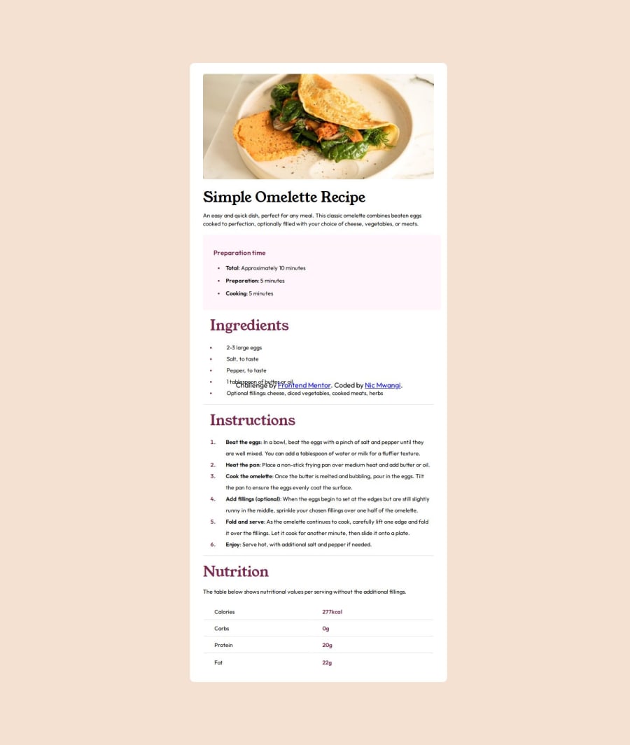
I'm most proud of the amount of time I spent making sure that my project was as close as a replica can be. I'm also proud of my use of table elements and @media query element. The thing I would do differently next time is try to finish faster.
What challenges did you encounter, and how did you overcome them?One of the challenges I faced was that my h1 title was stacking, so I used line height to make sure they weren't touching for my mobile view. Another issue was making sure the last row in my table had no border bottom, so I made a whole new table all together to fix the issue.
What specific areas of your project would you like help with?I would like help with how to better line up multiple divs and sections, so that they're in perfect alignment
Community feedback
Please log in to post a comment
Log in with GitHubJoin our Discord community
Join thousands of Frontend Mentor community members taking the challenges, sharing resources, helping each other, and chatting about all things front-end!
Join our Discord
