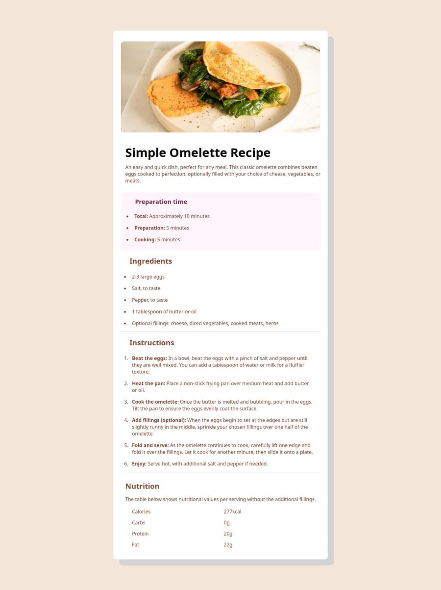


Design comparison

Solution retrospective
I guess I am proud of the fact that my end result looks pretty decent, regardless of my messy code. And I also think that I managed to make the site responsive to small mobile screens.
What challenges did you encounter, and how did you overcome them?It was a challenge to figure out all the different sections and finding ways to align everything properly within the container.
What specific areas of your project would you like help with?I am certain that my code is partly unnecessarily complicated and could be written in an easier/smarter way, but I hope with practice I'll get there.
Community feedback
- @JcmniaCSPosted 4 months ago
Looks great, I just finished this one as well. I had a lot of problems with the aligning of sections too.
If it wasn't intentional you can colour just the bulletpoints of the
<li>elements.For example...
HTML:
<ol>
<li>chicken</li>
CSS:
ol li::marker {
color: red;
}
0

Please log in to post a comment
Log in with GitHubJoin our Discord community
Join thousands of Frontend Mentor community members taking the challenges, sharing resources, helping each other, and chatting about all things front-end!
Join our Discord