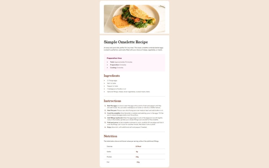
Design comparison
Solution retrospective
I tried to make it as close to the design provided as possible but i don't know the initial scale(
What challenges did you encounter, and how did you overcome them?Mobile design
What specific areas of your project would you like help with?I made mobile design, added media queries where needed but it doesn't seem to work on phone. I didn't understand why
Community feedback
- P@Fable54321Posted 4 months ago
Ok, I will try to be as exhaustive as I can on this one.
Obviously the first thing that is glaring to me is that your recipe card is way smaller than it should. You have made it so it fits all into the screen, wich was not how it was supposed to be.
In fact, I will say that trying to make a page being fully visible without scrolling is not good practice, as it can become an absolute nightmare on multiple pages projects and with different screen sizes.
Second thing I see you have used a <header> tag in your html. This is good, but you also imperatively need a <main> tag. Personally, I would have closed the <header> tag right after the recipe description and started the <main> tag right after.
Eventually you should take a more in-depth look at semantics and how to use all the good tags, but I would say that having a main one would be a really good start.
third thing As we can see, your image is "separated" from the rest of the card. The reason for this is because you have set a background-color for both your the img-container and the center-container. In your case the easiest thing to do would have been to apply the background-color only once to your header tag.
However, as said previously, having a header tag without any main tag is not semantically correct, so in the case where you would have your header and your main section, wrapping the two of these in a "wrapper" div, and then applying the background-color to that div would have been a good solution.
Fourth thing I don't know if you have corrected thing in the mean time, but your mobile version looks pretty close to me. You said you had issue with your media query, I did notice that your image would not change to a border-radius of 0, even though you were clearly trying to do so.
I am pretty sure I have found the issue. When I inspect your page, I can see that your media query is applying to your container but not your img itself.
I am sure this would be fixed if your img would be nested in its parent container in CSS. You tried to have your global section in your CSS, there could be some use cases for this, but it should not be used to apply specific changes on one element. Your intentions should always be as clear as possible. In that first img selector you are not applying general rules for all img, so that img selector should be nested in its parent container, so we know exactly what you are doing.
In your case it is also mainly to avoid issue with CSS who will deem what is at the bottom as more important at equal specificity, wich I am sure is what causing your border-radius to not change with your media-query.
Overall, you are on the right path, keep up
Marked as helpful1 - @kingkokopandaPosted 4 months ago
It seems that you have some issues within your css file that's causing you to have an error when trying to view the mobile version. I am quite new so its a bit tough to explain. However, if you get a chance, take a look at my sizes for my card in the link provided below. Also, I don't think your font populated from the import you have selected at the top of your css coding. You may have to make adjustments to your imported file, so that the system recognize where you are trying to pull from.
1
Please log in to post a comment
Log in with GitHubJoin our Discord community
Join thousands of Frontend Mentor community members taking the challenges, sharing resources, helping each other, and chatting about all things front-end!
Join our Discord
