Solution retrospective
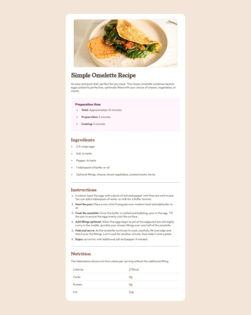
I think I had a pretty good work flow on this challenge. I used several divs to separate each section which help me think one sections at a time. I also learned a little bit about making tables when I made the nutrition section at the bottom.
What challenges did you encounter, and how did you overcome them?I had trouble getting the two lines of the paragraph at the top to look like the design. I solved this by making the main container wider. I also had trouble with the table in the nutrition sections. I had to figure out how to make a table with only a bottom border. All in all I guess I learned a little bit about making tables.
What specific areas of your project would you like help with?Is there a way to format paragraphs to have specific amounts of words on each line?
Please log in to post a comment
Log in with GitHubCommunity feedback
No feedback yet. Be the first to give feedback on Malarpit16's solution.
Join our Discord community
Join thousands of Frontend Mentor community members taking the challenges, sharing resources, helping each other, and chatting about all things front-end!
Join our Discord