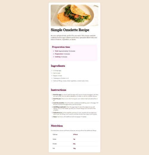
Submitted over 1 year agoA solution to the Recipe page challenge
Omelette-Challenge-Soloution
@Pauljd1

Solution retrospective
What are you most proud of, and what would you do differently next time?
.
What challenges did you encounter, and how did you overcome them?.
What specific areas of your project would you like help with?Spacing and lining up the bottom part with the nutrtion, I feel like I hacked it to make it work.
Code
Loading...
Please log in to post a comment
Log in with GitHubCommunity feedback
No feedback yet. Be the first to give feedback on Pauljd1's solution.
Join our Discord community
Join thousands of Frontend Mentor community members taking the challenges, sharing resources, helping each other, and chatting about all things front-end!
Join our Discord