Design comparison
SolutionDesign
Please log in to post a comment
Log in with GitHubCommunity feedback
- @eman2point0
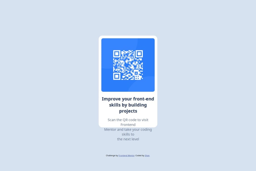
I would recommend surrounding your
h1element andpelement with adivto make sure they stay inside your box container without bleeding over.<div class='text-description'> <h1> Bold Lettering </h1> <p> Instructions here.</p> </div>You can then use
display:flex;to give them even space andflex-direction: column;to make them line up vertically.
Join our Discord community
Join thousands of Frontend Mentor community members taking the challenges, sharing resources, helping each other, and chatting about all things front-end!
Join our Discord
