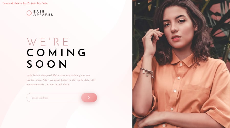
OH LORD!!! It's Javascript time! 0_0 Flexbox makes an appearance too!
Design comparison
Solution retrospective
Thanks for checking out my project.
I had a bit of an issue with <form> and inputs and all that. I was learning everything as I went along. I'd be very interested in feedback related to my form submit process.
Also the hero image that had to swap from mobile to desktop gave me a headache in the beginning. I am not sure if my solution is optimal or "correct" or even moral in the eyes of the lord. But any help there would be appreciated too.
Thanks a ton, Gareth
Community feedback
- @vanzasetiaPosted almost 3 years ago
Hi, Gareth! 👋
Congratulations on completing this challenge! 🎉
Some suggestions from me.
- The navigation links are on the top of the page content. I would not recommend setting it as
position: absolute. I would recommend making the navigation as an attribution instead. Also, put the attribution below themainelement. Doing this will make the page structure better. - For the validation, I prefer making the
formelement listen to thesubmitevent. After that, run the validation. 😅 - For the hero image, you can try using grid to align the layout. Also, if you decide to use grid, I would recommend using the
pictureelement to change the image based on the user viewport width.
That's it! Hope these suggestions help! 😁
0 - The navigation links are on the top of the page content. I would not recommend setting it as
Please log in to post a comment
Log in with GitHubJoin our Discord community
Join thousands of Frontend Mentor community members taking the challenges, sharing resources, helping each other, and chatting about all things front-end!
Join our Discord
