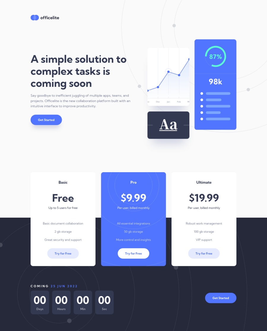
Officelite website | HTML, CSS, JS
Design comparison
Solution retrospective
Hello there!
This is my 1st challenge on Frontend Mentor and I really enjoyed it. I am pretty much satisfied with the final result.
Major challenge(s):
- The custom-styled select was a bit challenging. I used a list of radio button inputs to mimic the list of options and wired that with JavaScript to handle the events. While I this was a great opportunity to practice my JS skills, I still wonder if some of you have found a simpler approach for this feature.
Unsure of:
- When I validated the compiled css, I noticed that some of my sass variables went being output as well. I'm not sure if there is an issue with my breakpoint mixin or if it is because I recently switched from @import to @forward and @use in my
.scssfiles. I'd be grateful if you could point out what I'm doing wrong here. - The accessibility validation notified me of 3 contrast errors, I chose to ignore them and stick to the design. Would you have done same ?
Bonus features:
- The signup form shakes to display the invalid state and flips to display a success message when valid.
- I added some animations using GSAP and the ScrollTrigger plugin.
Your feedback would be much appreciated.
Thanks in advance. 🙏
Community feedback
- @ohermans1Posted almost 3 years ago
Hey Mate
Just want to say that this is awesome! I really like the shake on invalid for the form - I'm gonna give it an idea in a future project!
I'm looking forward to seeing what you do next!
Ollie
0P@christopher-adolphePosted almost 3 years ago@ohermans1
Happy that this inspires you mate. 😎
I have a lot things on the stove right now. I definitely need to make some time to take on the next challenge.
Regards
0
Please log in to post a comment
Log in with GitHubJoin our Discord community
Join thousands of Frontend Mentor community members taking the challenges, sharing resources, helping each other, and chatting about all things front-end!
Join our Discord
