(Almost) Pixel-perfect Landing Page With Svelte, Sapper
Design comparison
Solution retrospective
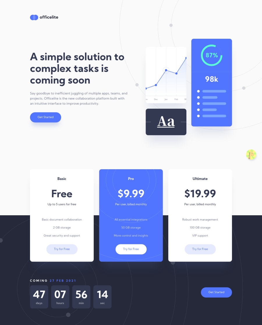
Yeah, kind-of-almost pixel-perfectβsome of the text is slightly misaligned and the progress bar in the hero image is rotated the opposite way in my solution, for some reason. π
Anyway, this was such a beautiful design and I learned a lot from creating it! I ended up having to use Sapper and to learn about things like routing and server-side renderingβwhich spun around my head a little, but I'm hanging in there! π
I added some pretty micro-interactions to the buttons and the form as an extra touch! π
Of course, feedback is both welcome and appreciated. π
And as usual, keep on coding (and happy coding, too)! π
BTW, one quirk I'm aware of is that the countdown timer resets when you go back-and-forth between the home and signup pages.
Community feedback
- @Nam-HaiPosted almost 3 years ago
The only thing that could be improved (beside the clock reseting at each reload) would be that when clicking on "Try for free" links for Pro Pack or Ultimate Pack, the subscription page selection automatically the right Pack in the form. Here it is by default on Free Pack. In real world use this would be misleading for the user and might lead to confusion.
Anyway, your work is sick, I never saw a webpage THIS close to the OG disign, this is truly pixel perfect
2@ApplePieGiraffePosted almost 3 years ago@Nam-Hai
Hey, there! π
Sorry for my late reply! π
Thank you very much for your comments! I probably took a little too long trying to get this solution reasonably close to being "pixel-perfect." Anyways, it was fun! π
Thanks for your suggestion, as well! π
Happy coding! π
1 - @karenefereyanPosted over 3 years ago
Superb work. Was just wondering, If I attempt to sign up for the free, pro or ultimate plans by clicking their respective buttons, shouldn't the sign up form automatically update to show the chosen plan? Cos right now no matter what button I click, the free plan is chosen by default
2@ApplePieGiraffePosted over 3 years ago@karenefereyan
Thanks! π That's actually good idea that I missed! π Thanks for pointing that out! π
1 - @areklazPosted over 3 years ago
Wow. I wish i could have such skills and become senior master extra developer like you.
2@ApplePieGiraffePosted over 3 years ago@archi1397
Haha, I believe I still have much to learn, archi1397! π Just keep practicing (such as by doing pretty challenges like these) and I'm sure you'll learn lots and become better! π
1 - @mattstuddertPosted almost 4 years ago
Another awesome project APG, and I'm loving the ripple effect on the call-to-actions! π
You seem to be loving Svelte and it's awesome that you dived into Sapper for this project. Sounds like you're learning a lot!
Keep up the amazing work π
3@ApplePieGiraffePosted almost 4 years ago@mattstuddert
Thanks, as usual, Matt! π
1 - @alnahian2003Posted almost 4 years ago
Hey, Apple Pie Giraffe!
WOW !!! You did an excellent job and your submitted project looks totally perfect on my screen! I also checked the responsiveness and it's really cool.
You know what, I'm thinking like, I should take the same challenge and I should follow your style :D
You got my β₯ on this project :)
Happy Coding, Mate!
3@ApplePieGiraffePosted almost 4 years ago@alnahian2003
Thanks so much, alnahian2003! π Happy coding you, too! π
2@alnahian2003Posted almost 4 years agoIt's my pleasure @ApplePieGiraffe ! Happy Coding <3
2 - @emestabilloPosted almost 4 years ago
Hey APG! My favorite is the click interactions on the buttons. Svelte seems like an efficient way to get a site up and running and your projects are inspiring me to look into it π This one looks pretty much pixel perfect to me!
2@ApplePieGiraffePosted almost 4 years ago@emestabillo
TY, emestabillo! π
2
Please log in to post a comment
Log in with GitHubJoin our Discord community
Join thousands of Frontend Mentor community members taking the challenges, sharing resources, helping each other, and chatting about all things front-end!
Join our Discord