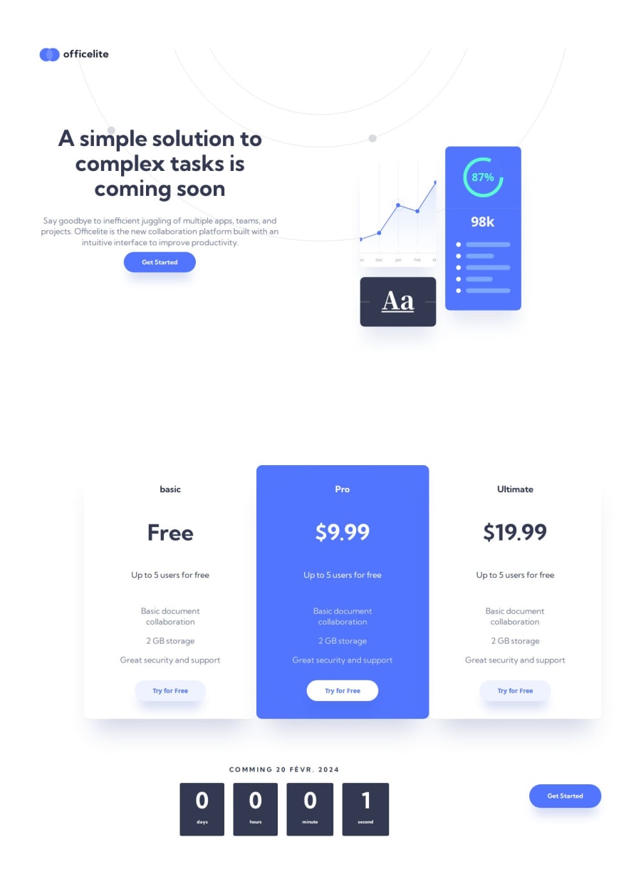
Design comparison
SolutionDesign
Solution retrospective
Hi, this was my first project, with REACT-ROOTER-DOM and I will appreciate if you would like to give me some advice on its use.
- On my second page I created two sections and used a BACKGROUND-IMG for my second section to put an img. I used display flex and directional row and column to switch between desktop screen and mobile screen, but my problem is that I can't use height: 100% or width 100%, I have had to use the px or vh. This is not good when page scroll, how can I improve it?
- how to add a css style on the <option> balise in the <select> balise or should you use css frameworks?
Community feedback
Please log in to post a comment
Log in with GitHubJoin our Discord community
Join thousands of Frontend Mentor community members taking the challenges, sharing resources, helping each other, and chatting about all things front-end!
Join our Discord
