Design comparison
Solution retrospective
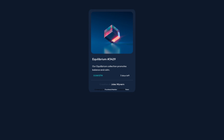
I've been unable to add the hover effect, somehow it just doesn't work. I'm open to any and all constructive criticism and suggestions, thanks.
Community feedback
- @HarshPrateek559Posted over 2 years ago
I think the design is great. You have put in the effort and must have learned a lot from this project
Although, there are a few things that can still be fixed.
1:) You should make your card at the absolute center of the screen. To achieve that, you can do to achieve that is to make the body have 0 paddings and 0 margins while making it have 100vh of height and 100vw of width. As you already made the body a flex container so this move would automatically center the div for you.
2:) Make the image absolute positioned and then give it a z-index of 1. Make another element in your HTML with the required color and place it on top of the image with the visibility hidden property. When hovered over, make this element visible. This would give you the same effect as you want.
I think that if you implement these solutions then the project would become perfect.
Let me know what happened😊
Marked as helpful0
Please log in to post a comment
Log in with GitHubJoin our Discord community
Join thousands of Frontend Mentor community members taking the challenges, sharing resources, helping each other, and chatting about all things front-end!
Join our Discord
