Submitted almost 2 years ago
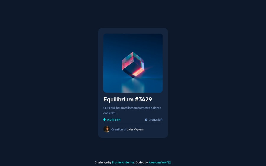
NTF Card Using Display Fex; Float and other Technics
@AwesomeWolf22
Design comparison
SolutionDesign
Solution retrospective
That was a fun challange, I love to make cards, products and stuff.
If anyone know a technic to get my code better feel free to comment.
Community feedback
- @frank-itachiPosted almost 2 years ago
Hello there π. You did a good job!
I have some suggestions about your code that might interest you.
CSSπ¨:
- Avoid using absolute length units px, especially for font-size and width properties, because they are not relative to anything else so that means they will always be the same size. Instead, you can use relative lengths like em or rem. The benefit of that last one is element which has that unit will scale relatively to everything else within the page, e.g., the parent container. You can dig up about it here
I hope you find it useful! ππ Above all, the solution you submitted is greatπ!
Happy
<coding />
π!Marked as helpful1
Please log in to post a comment
Log in with GitHubJoin our Discord community
Join thousands of Frontend Mentor community members taking the challenges, sharing resources, helping each other, and chatting about all things front-end!
Join our Discord