Design comparison
SolutionDesign
Please log in to post a comment
Log in with GitHubCommunity feedback
- @Shayneze
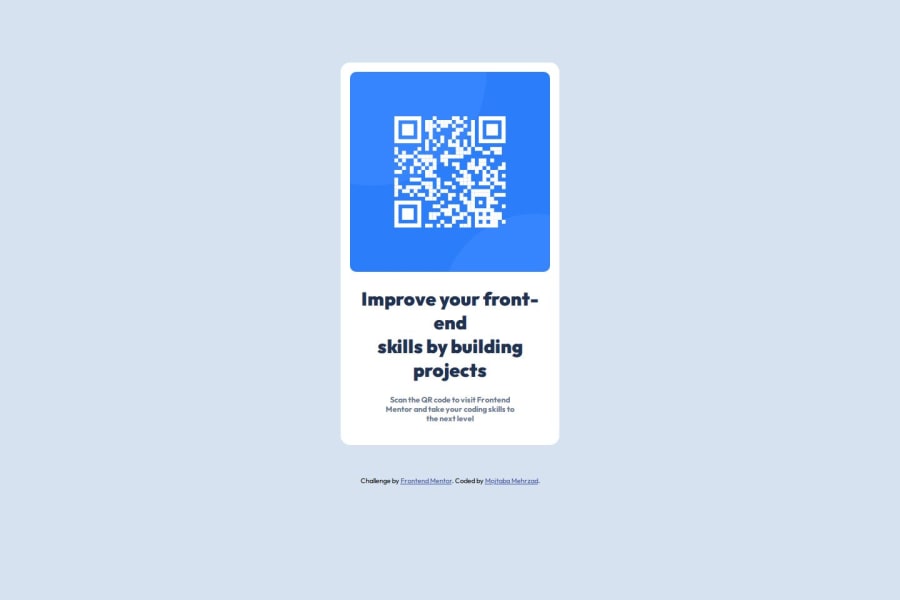
Good use of semantic HTML, the code is well structured and readable. The result is good
More attention could have been paid to the design elements given in the Figma documents:
- font in bold for the text when the template shows a regular font
- line heigt hasn't been changed
- default margin are still present thus the spacing is not the same as in the template
- border radius of 15px instead of 20px for the card etc.
Marked as helpful
Join our Discord community
Join thousands of Frontend Mentor community members taking the challenges, sharing resources, helping each other, and chatting about all things front-end!
Join our Discord
