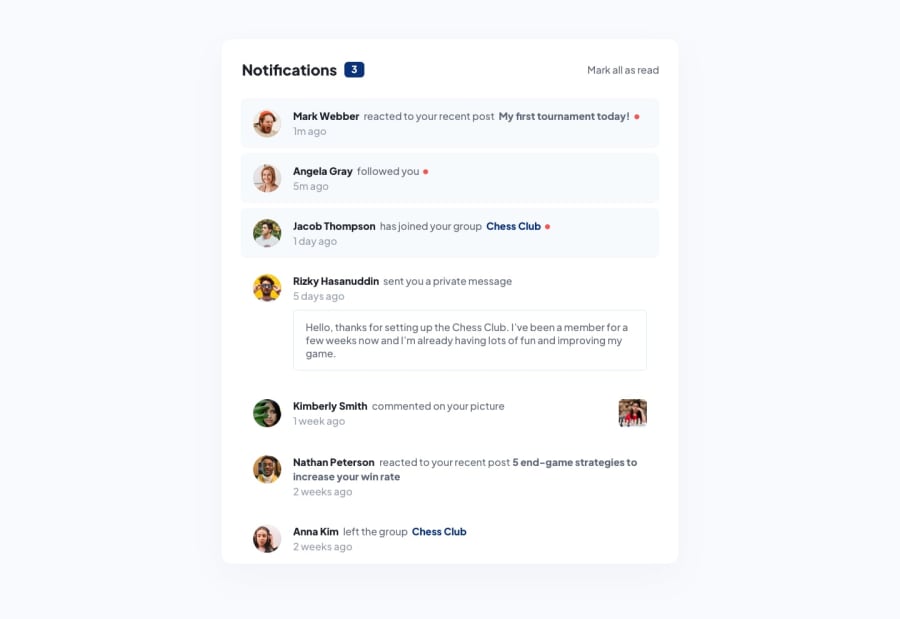
Design comparison
Solution retrospective
All feedback is welcome
Community feedback
- @CodyyLeePosted about 2 years ago
Hey Norbert!
Looks like you're on the right track! The layout of the page is looking close, and that is awesome. Looking at your GitHub, it seems you didn't include the assets folder and so it is only showing the alt tags. I'd recommend pushing them to GitHub so everyone can see the page in all of its glory!
I'd also adjust the colors that were used for the body background and the 'New notifications' background. They're a bit darker than the design's. Another thing to implement would be the font-family used in the design as well as some font-weights to get it as close to the design as possible.
Finally, it doesn't look like you're able to toggle the notification state's. I'd create a .js file to include this functionality.
Great work! :)
0
Please log in to post a comment
Log in with GitHubJoin our Discord community
Join thousands of Frontend Mentor community members taking the challenges, sharing resources, helping each other, and chatting about all things front-end!
Join our Discord
