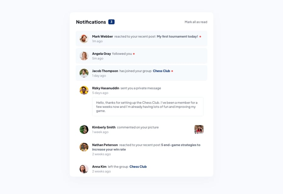
Design comparison
Solution retrospective
There is still plenty work to do, the JS part is as good as go.
Community feedback
- @Klaudia-CzerskaPosted about 1 year ago
The desktop version looks really good! Sizing of elements is pretty much the same as in design, that's nice. There are some problems on mobile screens thought. I have noticed that the number of notifications goes down when clicking in the same notification multiple times, you may want to try to tie this number to the quantity of unread notifications.
Marked as helpful1@nisarusanPosted about 1 year ago@Klaudia-Czerska Thank you for your feedback, I didn't know about that click-element, yes u right. I will check now what I can do about it.
I'm happy u like the desktop version, yes the mobile version I need to improve there.
0
Please log in to post a comment
Log in with GitHubJoin our Discord community
Join thousands of Frontend Mentor community members taking the challenges, sharing resources, helping each other, and chatting about all things front-end!
Join our Discord
