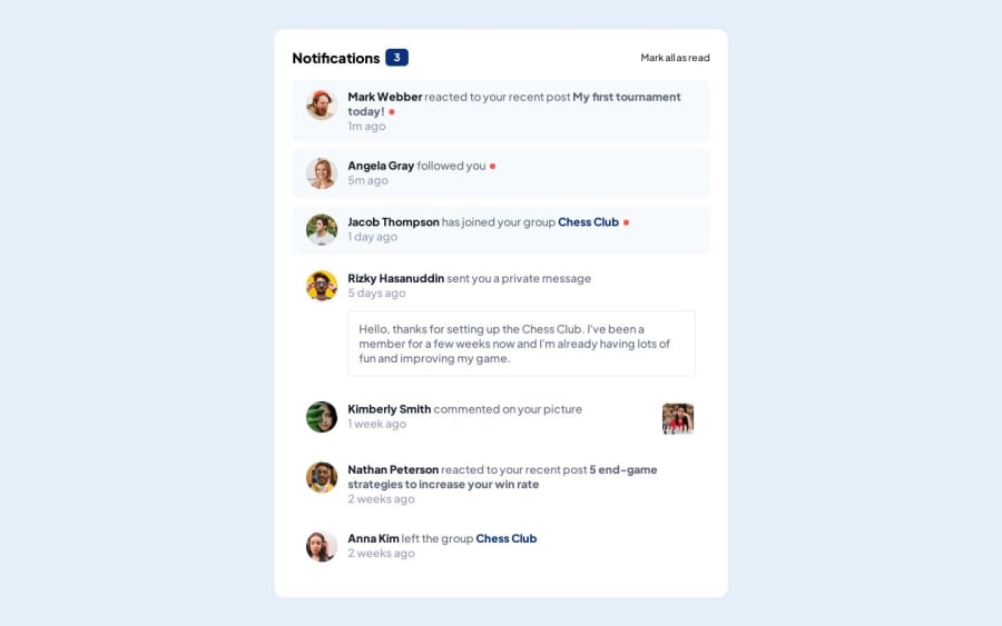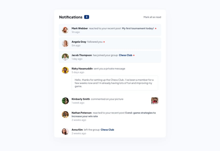
Design comparison
SolutionDesign
Community feedback
- @NehalSahu8055Posted over 1 year ago
Hello Coder 👋.
Congratulations on successfully completing the challenge! 🎉
Few suggestions regarding design.
➨ Use
Semanticsfor the proper design of your code.<body> <header> <nav>...</nav> </header> <main>...</main> <footer>...</footer> </body>-
Every site must have one
h1 elementdescribing the main content of the page. -
So, Add a
level-one headinginstead ofptoimprove accessibility. -
<h1>Notofications</h1> -
Use
responsive units(rem, em, %)from next project. Explore respective use cases on google.
link.
- Try to implement JS part its easy.
- Clicking on
Mark all as readwill clear allred circles, notification numbers, and active bg.
I hope you find this helpful.
Happy coding😄
Marked as helpful1@hyeo151Posted over 1 year ago@NehalSahu8055
Thank you for your feed back !! I will put them in practices in next projects : )
1 -
Please log in to post a comment
Log in with GitHubJoin our Discord community
Join thousands of Frontend Mentor community members taking the challenges, sharing resources, helping each other, and chatting about all things front-end!
Join our Discord
