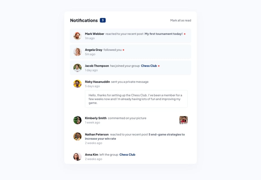
Design comparison
Solution retrospective
Reviews please! If there's anyway I can improve this please help out
Community feedback
- @BankoleCalebPosted about 1 year ago
Hi. You did a good job on this project and congratulation on your new job - I saw it on LinkedIn.
First, I realized that not all part of your "go back to notifications" button is clickable. User has to click on the text itself. You can look it up Also, you are logging a message to the console. You should have cleared all your console.log() before deploying.
Thirdly, when you click the "go back to notifications" button, your home page still shows three notifications unread even after one has read it before clicking a notification.
Good job and keep coding. How was your UTME score? Did you attend Adams' College post-UTME class?
Marked as helpful0
Please log in to post a comment
Log in with GitHubJoin our Discord community
Join thousands of Frontend Mentor community members taking the challenges, sharing resources, helping each other, and chatting about all things front-end!
Join our Discord
