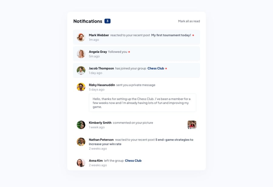
Design comparison
Solution retrospective
Reviews are welcome !
Help me become better 😍
Community feedback
- @FloratobyDevPosted about 2 years ago
It's pretty close to the design. Probably just need a little bit of resizing and making sure that it looks nice on mobile. The error is probably an easy one but basically what it's trying to say is that you should avoid it or else you'll be getting problems. For example, you might want to start an event with that button but since you have two interactive elements in an enclosed area, there could be times when the event wouldn't trigger because you click the other button that doesn't have the trigger. Small problem but it can cause a ton of frustration. Well done finishing the project!
Marked as helpful0
Please log in to post a comment
Log in with GitHubJoin our Discord community
Join thousands of Frontend Mentor community members taking the challenges, sharing resources, helping each other, and chatting about all things front-end!
Join our Discord
