

Design comparison
SolutionDesign
Solution retrospective
What are you most proud of, and what would you do differently next time?
nothing
improve readability of html and css
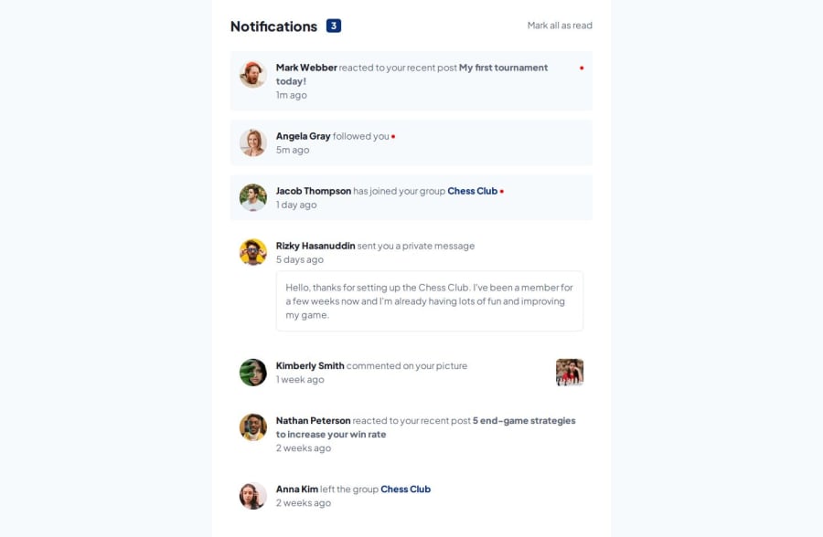
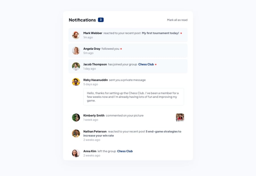
What challenges did you encounter, and how did you overcome them?the red dot: i made the width for text 99%
What specific areas of your project would you like help with?how do i fix the red dot as it compresses on smaller screens when text is long
how can I improve the layout so that I can fit all three components of the card in the same way as the designs. Because although I had the same container width, I couldn't fit everything for the longer texts
Community feedback
- @AliRezaCodingPosted 11 months ago
Hello friend, In mobile size decrease padding of your container and give the red dots margin-left: 5px
0

Please log in to post a comment
Log in with GitHubJoin our Discord community
Join thousands of Frontend Mentor community members taking the challenges, sharing resources, helping each other, and chatting about all things front-end!
Join our Discord