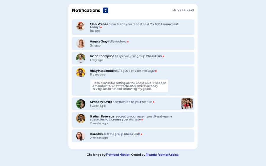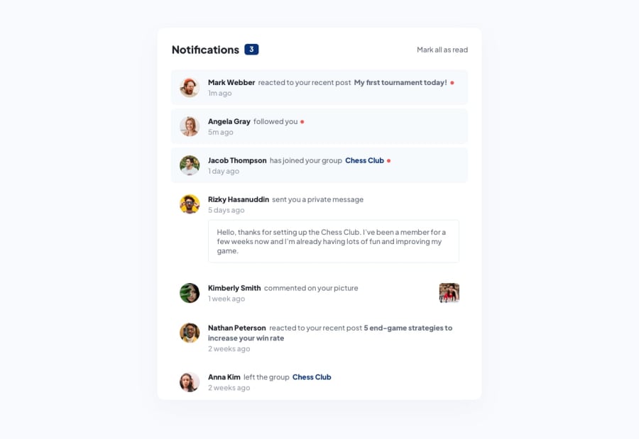
Notifications page with React, html, sass.
Design comparison
Solution retrospective
What do you guys think about the responsiveness? What do you think about the visual aspect of the page? does it look good? What are some practices that you think can be improved?
Community feedback
- @isadfrnPosted over 1 year ago
Hello!
First of all, you did an amazing job, I tested using a tool for simulating some mobile devices and fits very nicely. Nice work!
Visually the page is really good, similar to the proposed one.
As a best practice, I suggest that in your NotificationsList component, it will be better to take out all of that image variables to a separate file, just to ensure the readability of your component.
1@RicardoFuentes437Posted over 1 year ago@isadfrn Thank you very much for your feedback, looking at the NotificationsList component it does look messy with all the variables there, i'll definitely change that and keep that in mind for future challenges, thank you for pointing that out :)
1
Please log in to post a comment
Log in with GitHubJoin our Discord community
Join thousands of Frontend Mentor community members taking the challenges, sharing resources, helping each other, and chatting about all things front-end!
Join our Discord
