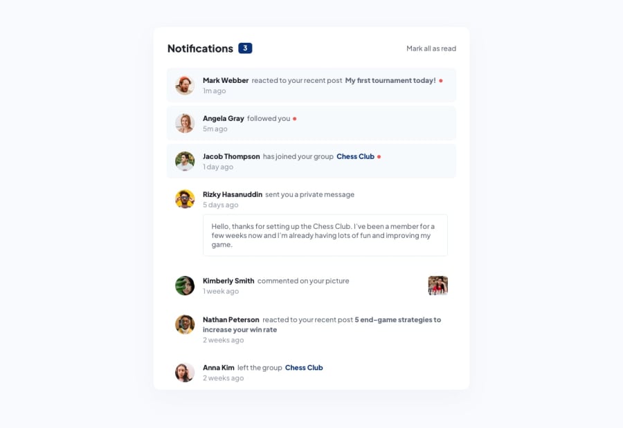
Design comparison
Solution retrospective
This was a fun challenge, my first React project! I put the user data into its own file to mimic pulling from an API. I definitely had to adapt to the lack of separation of concerns using JSX. Because of this, I changed the way I did my CSS. I'm wondering if doing the CSS this way will make it more readable/ETC. If anyone has any thoughts please let me know : )
Community feedback
- @fazzaamiarsoPosted over 2 years ago
Hi Eileen! Great Work!
I have a few suggestions for you.
- When you don't want to use a the returned array, don't use
.map, but use.foreach. I have made an improvements, but using reduce.
useEffect(() => { const counts = data.reduce((acc, currEl) => user.read ? acc + 1 : acc ,0 ) setCount(counts) }, [])- For your conditional styling, I think it's better to add/remove classes conditionally rather than
styleprops or use css modules.
I hope it helps! Cheers!
1 - When you don't want to use a the returned array, don't use
- @fisttyPosted over 2 years ago
Hi Eileen! Amazing work! I did notice that the page content does not fully display on devices that are not up to 900px. This can be changed by removing
justify-content: centeron the<body>element. I can see that you made the rule on multiple elements, so you can make another rule likebody { justify-content: unset }. Then you can set apadding-topto thebodyelement to move it away from the top.0
Please log in to post a comment
Log in with GitHubJoin our Discord community
Join thousands of Frontend Mentor community members taking the challenges, sharing resources, helping each other, and chatting about all things front-end!
Join our Discord
