Submitted about 1 year ago
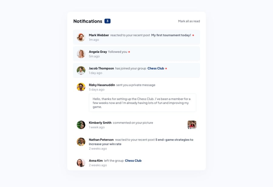
Notifications page with HTML, tailwindcss and vanilla javascript
@ratul0407
Design comparison
SolutionDesign
Solution retrospective
Even though I used tailwindcss on my project. I named everything and then I styled them using the @apply. I don't know if it was a good idea. Let me know your thoughts.
If there is any best practices that I missed out or anything that I can improve please let me know👍👍
Follow me and be a part of my journey on completing all free frontend mentor challenges (21/62)✌✌
All feedbacks are welcomed
Community feedback
- @Orib-FarhanPosted about 1 year ago
- If I mark any message read the notification still shows that there are 3 unread messages. I think you forgot to change it in JavaScript. If you change it I think it will look more professional.
- If I open the site in smaller screen devices the "Kimberly Smith" comment shrinks a lot making it out of place. Which doesn't look good at all. So, please correct it.
- If you added some space on bottom and upper section in your container, It will make things much more cool. Also under 1023px device screens there isn't any space on both upper and bottom side, which also doesn't look good at all.
Thank you for giving attention to my comment. Hope you find this helpful.
Marked as helpful0@ratul0407Posted about 1 year ago@Orib-Farhan Thank you for viewing my challenge I'll definitely try to make the corrections.
1
Please log in to post a comment
Log in with GitHubJoin our Discord community
Join thousands of Frontend Mentor community members taking the challenges, sharing resources, helping each other, and chatting about all things front-end!
Join our Discord
