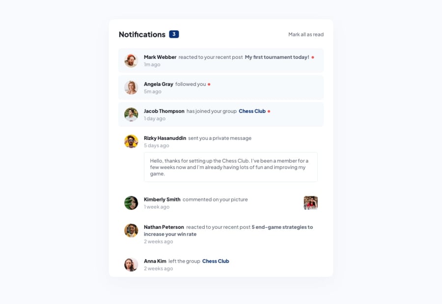
Design comparison
Solution retrospective
I would appreciate if someone could tell me how I could improve some of these points:
- The use of React context
- The array with the notifications
- The elapsed time
I plan to make some more changes these days, like using map, to place the notifications.
But it would be nice to have some suggestions 😄.
Community feedback
- @vaibhavbshetePosted about 2 years ago
I liked your idea of letting only the notifications scroll when the height is low. Adopting this in my solution too!
Please do check the placement of the red dot. In the designs it appears after the end of the sentence. But in your solution, in the first notification, it appears at the end of the line, even if the sentence continues on the next line.
Also the colours don't quite match up - in my solution as well as yours. We might need to play around a bit. Not altering the given colour values in the style guide, but trying all alternate values till it matches.
1@josueSN1402Posted about 2 years ago@vaibhavbshete Thanks for your feedback, I didn't realize that the red dot was misplaced. And I think you are right about the colors, particularly the one in the notification received, I think I will try to copy the color of the image using Figma.
1
Please log in to post a comment
Log in with GitHubJoin our Discord community
Join thousands of Frontend Mentor community members taking the challenges, sharing resources, helping each other, and chatting about all things front-end!
Join our Discord
